My third publication this year was in the new Magazine Lyun Magazine for their Spring issue. I had already shot this editorial as a test but I had not released all the images and therefore I felt they should be in print as they are too beautiful not to share.
Victoria is a fantastic model with perfect fluidity in her posing styles, One of my methods when shooting is to give basic direction and let the model express themselves how they feel comfortable- this has always given me the best images and beautiful portraits. Mostly it has made for comfortable shoots with a lot of fun involved.
FASHION
Fact + Fiction
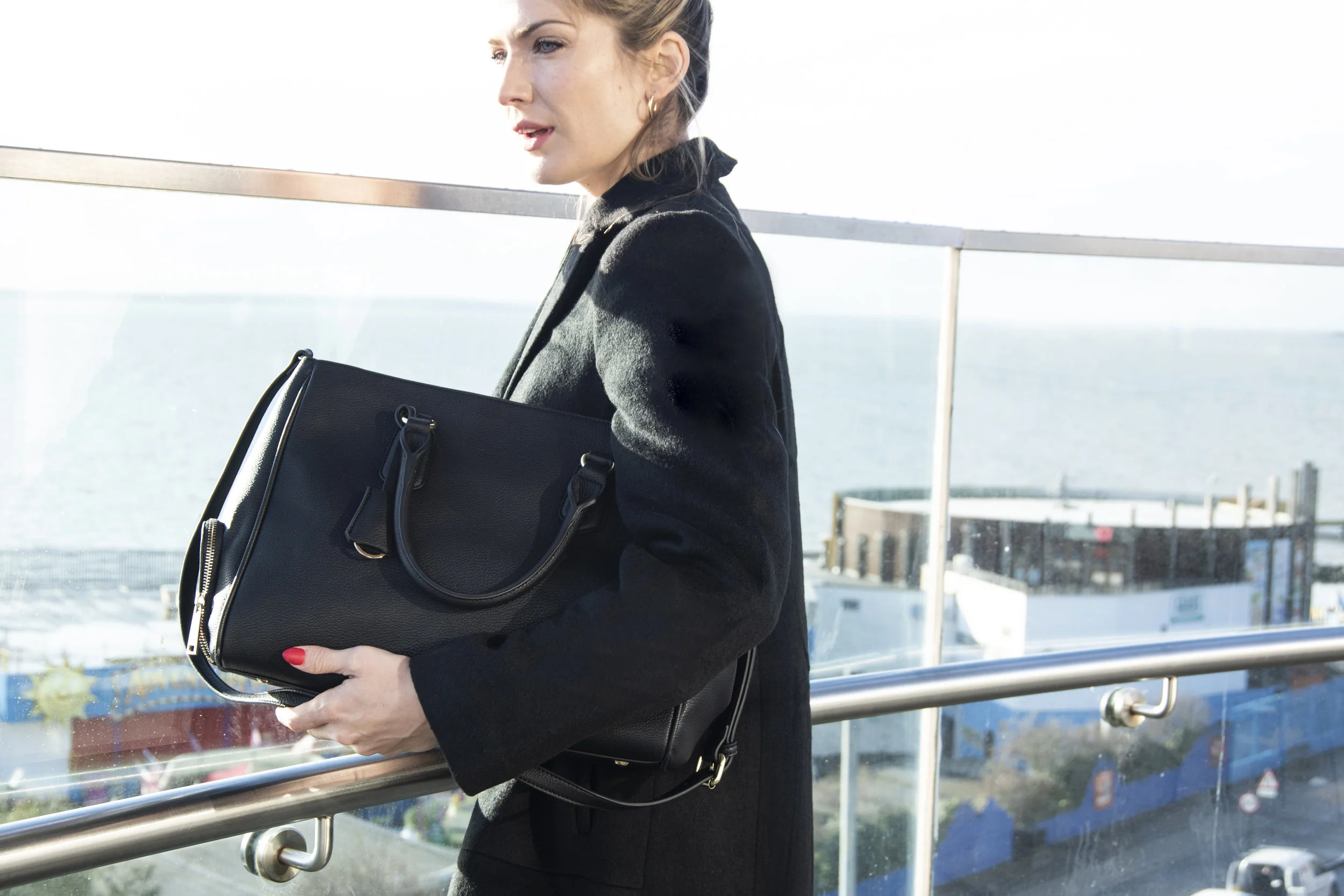
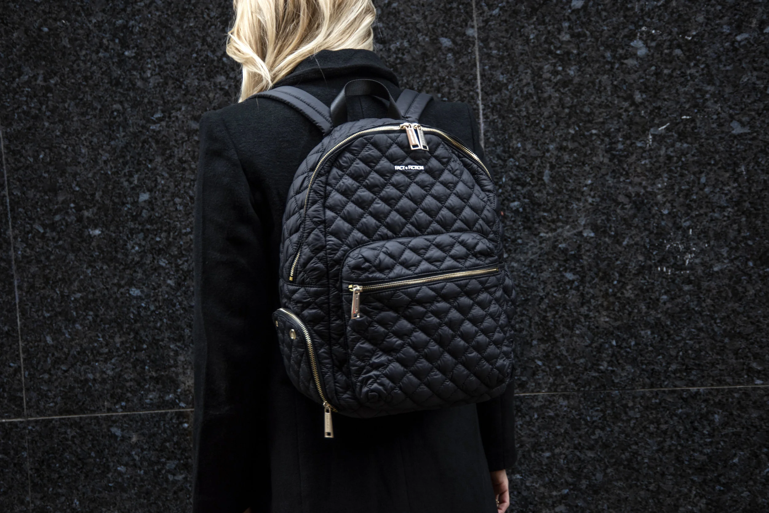
When I had planned to work with new brands, i didn’t expect to work with such a great brand so early. Fact + Fiction are a British brand and their bags have luxury sewn through them. When meeting with the girls it was clear they wanted to push their website to the next level and for their to be continuity throughout the site.
We will be continually collaborating on shoots throughout 2019 but to begin the year we launched with a very basic colour scheme, hinting in to the Pantone of the year- Coral, and remaining to brand.
I love to help brands design their sites through their photographic styling and the colour schemes that will best show their products. Their site is live and if you are interested in their bags- give them a look at
www.shopfactandfiction.com
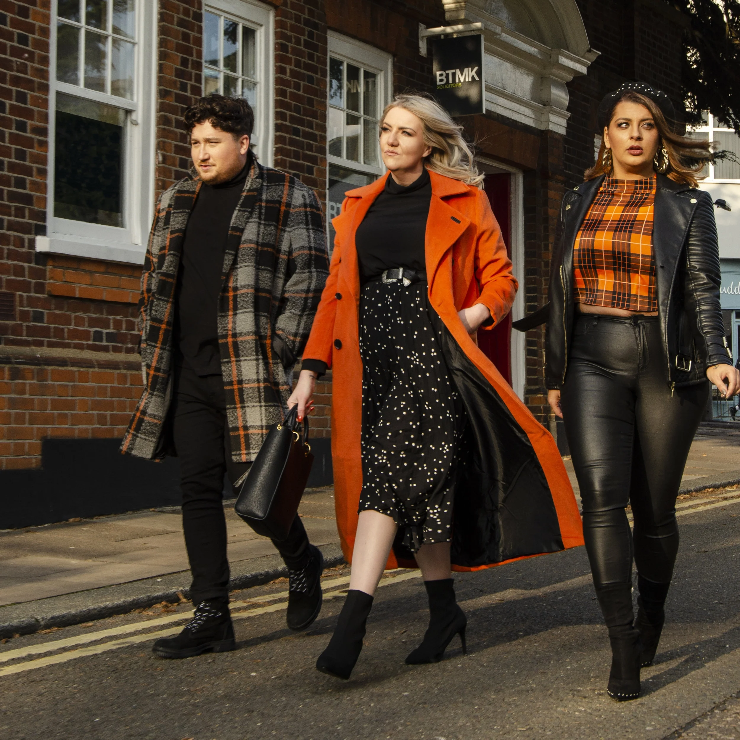
Beauty comes in all shapes & sizes
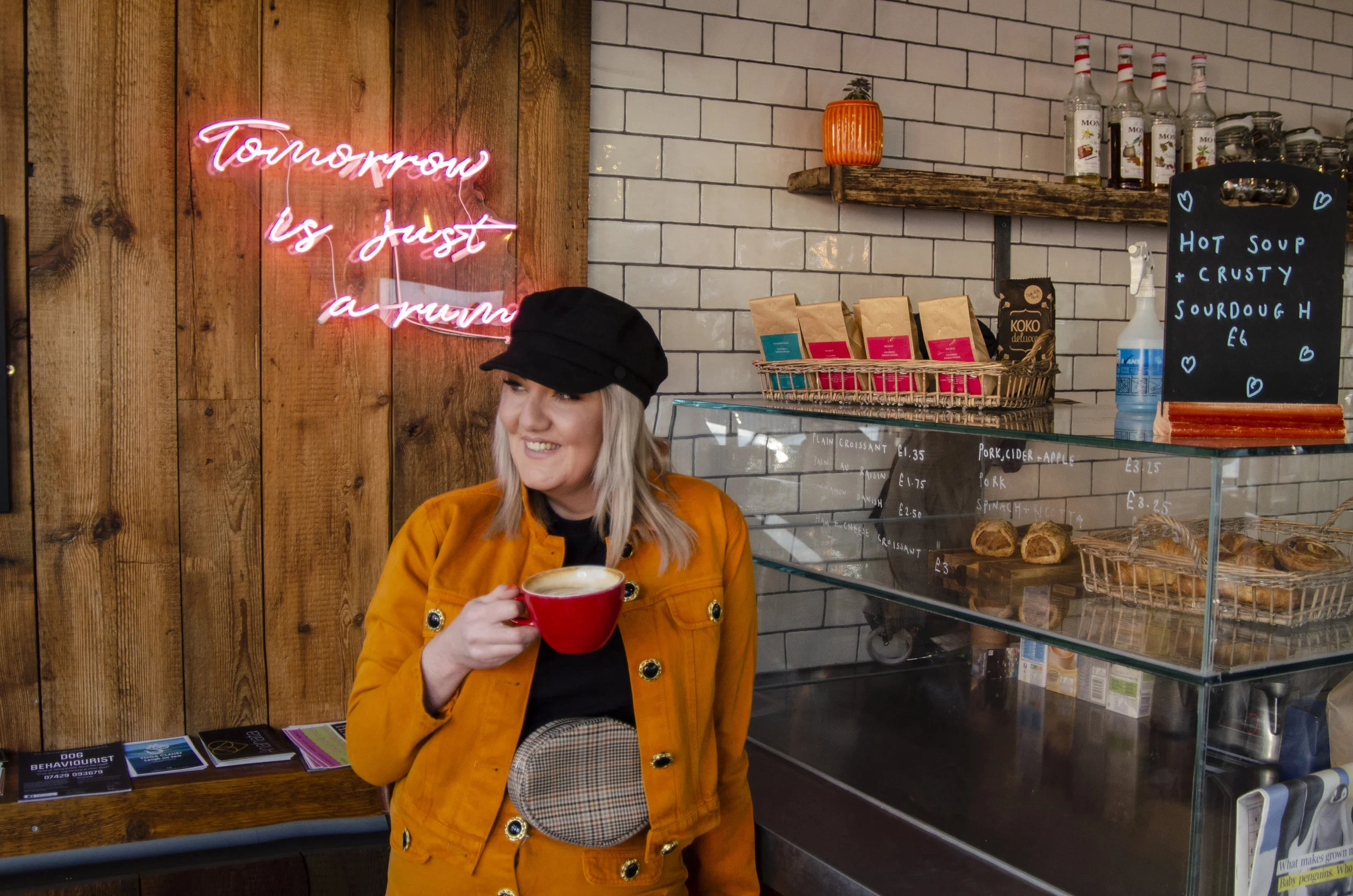
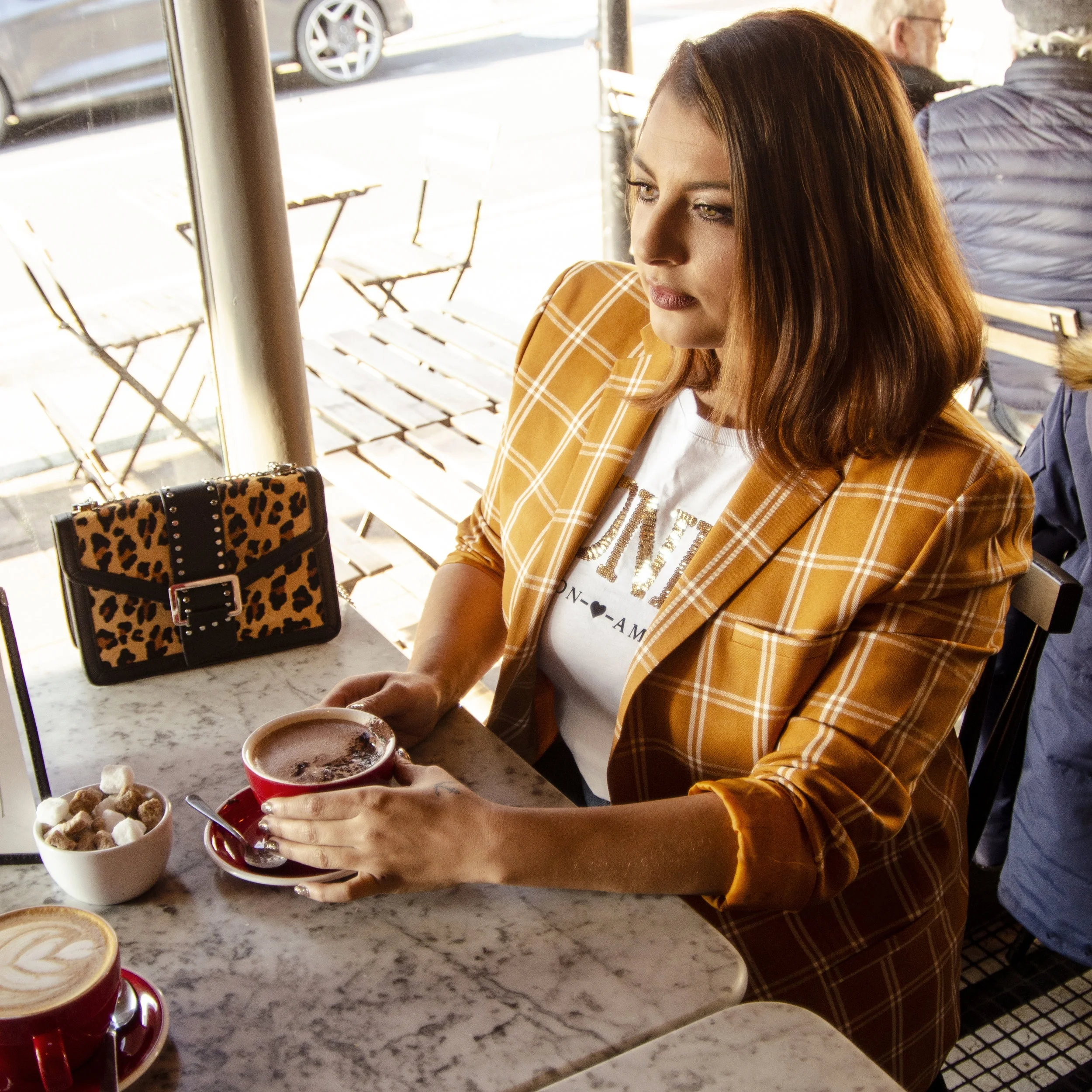
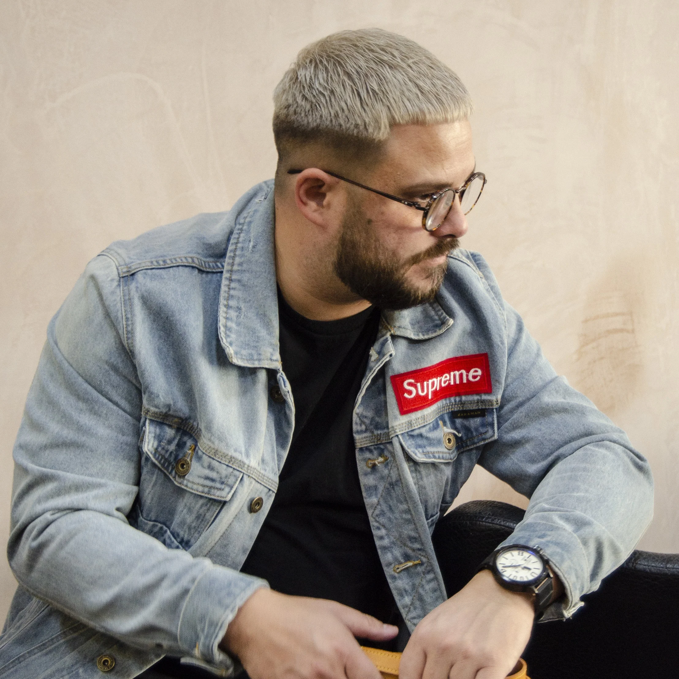
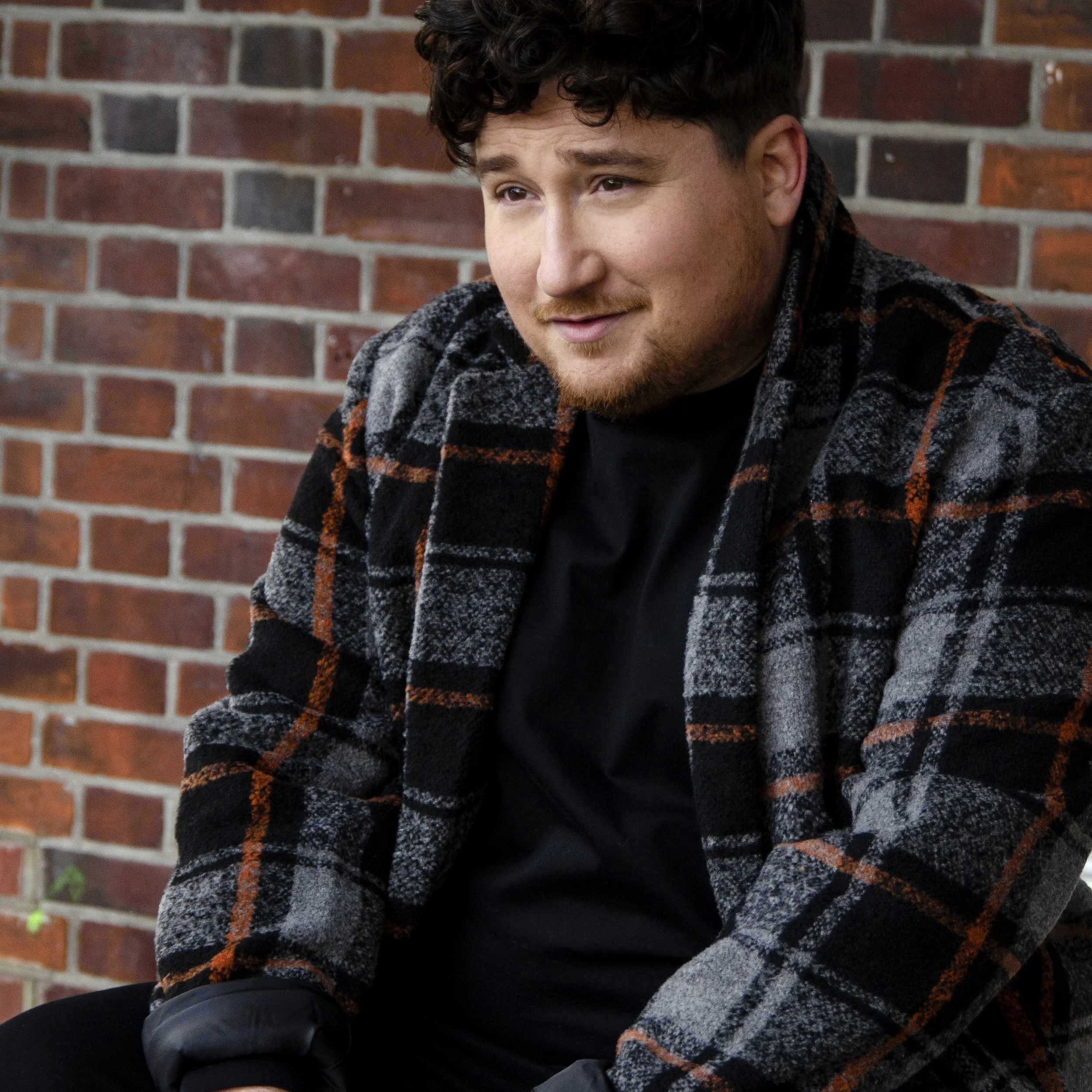
THIS WEEK IT WAS ALL ABOUT PLUS SIZE BLOGGERS JOEY, ROB & JEN- AND CREATING BODY POSITIVE PORTRAITS THAT WOULD SHOW THEIR PERSONALITIES AT THEIR BEST. HOWEVER BEING SOMEONE WHO IS ALSO PLUS SIZE, WE DECIDED I WOULD JOIN THE SHOOT AND PUT MYSELF IN FRONT OF THE CAMERA-SOMETHING THAT WAS OUT OF COMFORT ZONE BUT THIS SHOOT WAS FULL OF FUN, CONFIDENCE BOOSTING AND STYLE.
FOR BLOGGER STYLE SHOOTS, I CREATE A THEME, A MOOD BOARD AND FIND THE PERFECT LOCATIONS TO TELL YOUR STORY.
THE THEME OF THE SHOOT: PUMPKIN SPICE
LOCATION: LEIGH-ON-SEA.
B A N N E R S H O O T
WHEN I WAS ASKED TO SHOOT THE AUTUMN BANNER FOR EVERYTHING5POUNDS.COM, I WAS SO EXCITED TO BE ABLE TO CREATE A NEW LOOK FOR THE WEBSITE. ALONGSIDE THE TEAM WE CREATED AN URBAN MOODBOARD, SHOOTING IN AN INDUSTRIAL LOCATION.
THE COLOUR PALETTE WAS BLUE MIXED WITH WARM TONES, AND THE IMAGES WERE SHOT IN A VERY WARM OCTOBER- MEANING WE HAD TO TONE THE COLOUR PALETTE TO MIX THE TONES PERFECTLY.
IF YOU WOULD LIKE TO RE-BRAND YOUR WEBSITE, PLEASE GET IN TOUCH.


